Creating a design system helped me design 3 complex products from scratch for 2 platforms in 4 months and hand over product support to another designer. When I started working at WeavePay, the company’s main product was rather old-school in terms of its look and user experience, and only worked on desktop web browsers.
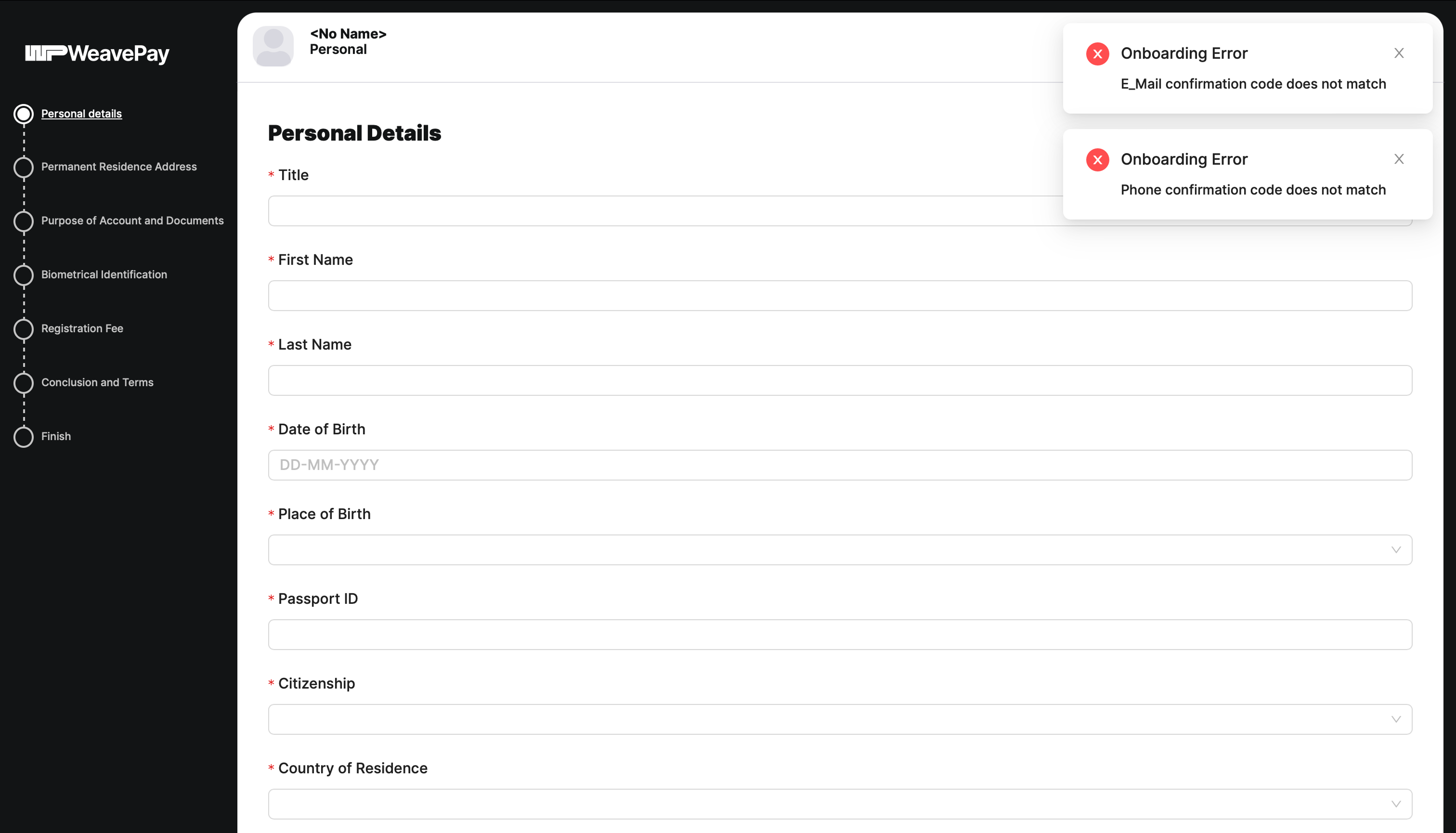
The first thing I did was to create a design system that could be used equally effectively on both desktop and mobile devices. Initially, my new interface elements looked a bit like a technical drawing (I had planned to enhance the visual style later on), but the CPO said that this was exactly what was needed – the so-called ‘Swiss style’, which is in keeping with the company’s ethos.
The two key principles on which I base my design system are interactivity and a hierarchy that reflects the categories of entities.
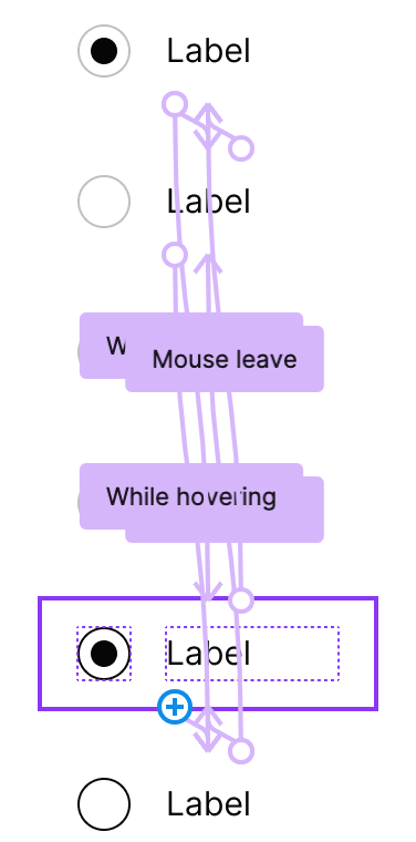
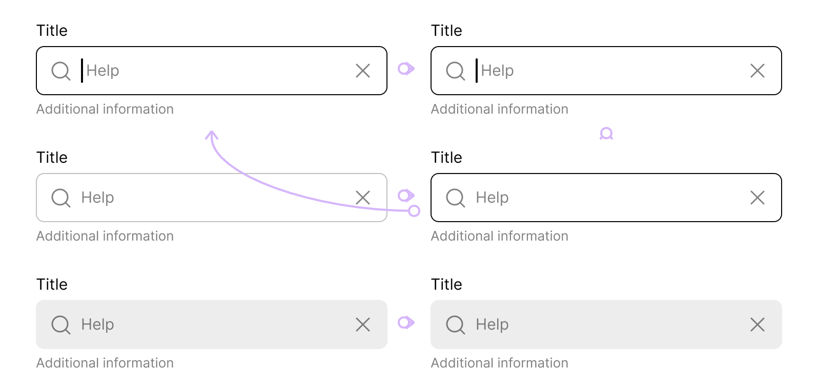
Interactivity means that all component variants are linked via Figma's prototype settings, so that each mock-up can be run in prototype mode at any time. You can see, for example, how checkboxes react when the mouse hovers over them, and how a user can tick a checkbox. In this way, mock-ups automatically become interactive at no extra cost, resembling the real product – there are no dead zones. Even the cursor in the input field blinks. The feeling of a live product is very important during user testing.
Category-based hierarchy means that we delve into the origins of the states, processes and data that make up an interface element. I wrote a separate tutorial on this, because many designers are unable to think in terms of categories. For example, an icon’s image and an icon's status are different categories at different levels of the hierarchy, even if the status is visually represented by a change in the image (colour, shape, size). A properly understood hierarchy simplifies both the design system itself and its implementation in code. Some designers believe that it's not worth spending time thinking all this through, and that one should simply draw the UI elements. However, if a designer has developed a system thinking, this work comes easily and naturally to them, and they save time in the long run.
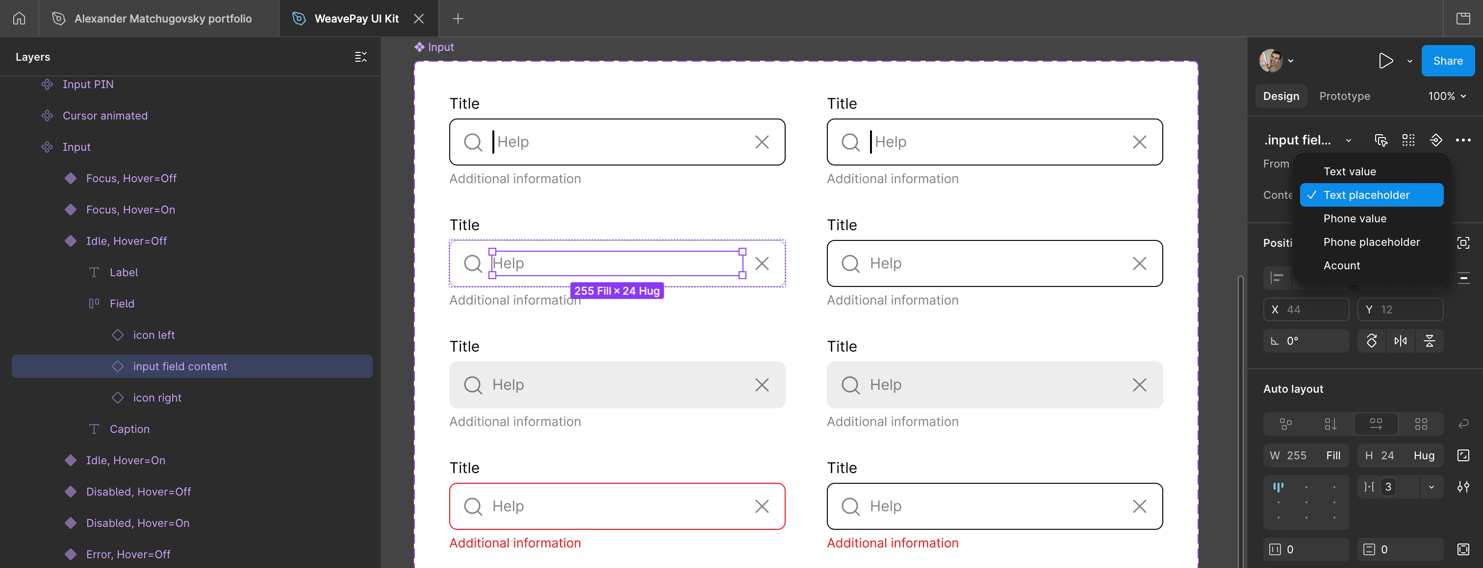
When designing the hierarchy within the design system, I even treated text blocks as separate entities with their own attributes, such as the size of their paddings. Paddings are also incorporated into other components, such as input fields. This allows screens to be laid out with zero spacing between elements, thereby eliminating inconsistencies. I’ve written a separate article on this topic.
Of course, as part of the design system, I’ve created colour tokens, typographic styles and so on. I’ll go into more detail about working with fonts and variables in the article on the InvestEngine design system.
The developers had no trouble implementing my design system in code. They managed it in a few days, and nothing needed to be reworked.