Typography
In the days of yore, when neither computers nor colour printing had yet been invented, people had already perfected the rules for presenting textual information within the limited space of a book page. Typography forms the basis of layout, so it makes sense to begin building a design system with typefaces.
Many designers begin to structure their type hierarchy in the order they see in books: title, subtitle, body text, footnotes. I have seen time and again that this approach leads to problems – there comes a point when the designer wants to create another level of nesting and delve into a new tier of the hierarchy (and this requires a new typeface of an even smaller size). On a computer, things work the other way round: the baseline is set not by the top, but by the very bottom of the hierarchy. So you need to start with the smallest font size. This is particularly important for complying with accessibility guidelines and taking personalisation into account – users can change the font scale and set a minimum acceptable size on their devices.
First, I create the Single Paragraph, Multi Paragraphs, Block and Section components in Figma. All of them, except the first, contain slots into which lower-level components can be placed. Each component contains strictly defined vertical indents and paddings. This is necessary so that the designer doesn’t have to guess which indents to apply when assembling components into a single stack – everything is aligned automatically thanks to the paddings built into the components. You don’t learn this on courses, but the most experienced designers have arrived at a similar solution. I wrote about this in a separate article – Margins are outdated.
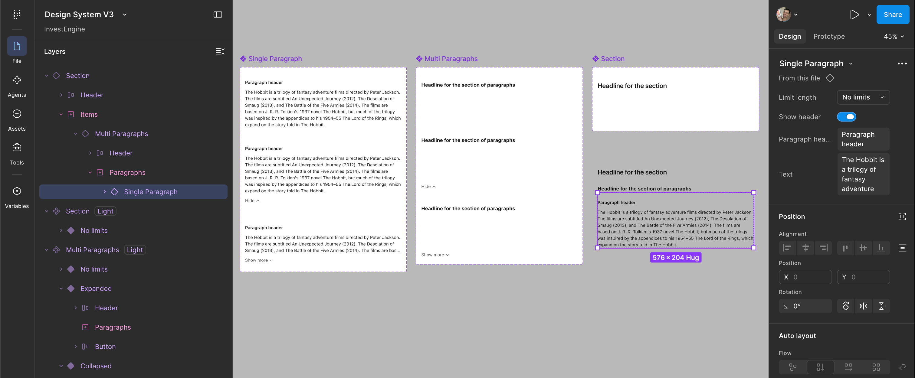
Each of the above-mentioned components has its own header, which can be disabled via the component’s properties. For paragraphs and multi-paragraphs, there are three options: No limits, Collapsed and Extended – the latter two feature a content collapse/expand button (I’ve linked these variants so that they work out of the box in the interactive prototype). This way, at the design system level, the maximum number of lines that can be displayed for collapsed text is fixed. You can store this value in a variable in case you want to experiment with the design system at an early stage of its development.
I then create a Typography collection of variables in Figma. The collection is divided into blocks: one block for each level of the typeface hierarchy. Within each block, the following variables are defined: Font family, Font weight, Font size, Line height. It’s tempting to include font colour in the description as well, but I’ll explain below why this is not a good idea.
| Name | Desktop | Mobile | Scale |
|---|---|---|---|
| Paragraph | |||
| Font family | SF Pro | SF Pro | SF Pro |
| Font weight | Regular | Regular | Regular |
| Font size | 16 | 16 | 21 |
| Line height | 24 | 24 | 31 |
| Paragraph header | |||
| Font family | SF Pro | SF Pro | SF Pro |
| Font weight | Semibold | Semibold | Semibold |
| Font size | 16 | 16 | 21 |
| Line height | 24 | 24 | 31 |
| Multi-paragraph headline | |||
| Font family | SF Pro | SF Pro | SF Pro |
| Font weight | Bold | Bold | Bold |
| Font size | 18 | 18 | 23 |
| Line height | 28 | 28 | 36 |
| Block headline | |||
| Font family | SF Pro | SF Pro | SF Pro |
| Font weight | Semibold | Semibold | Semibold |
| Font size | 24 | 24 | 31 |
| Line height | 32 | 32 | 42 |
| Section headline | |||
| Font family | Poppins | Poppins | Poppins |
| Font weight | Semibold | Semibold | Semibold |
| Font size | 44 | 30 | 57 |
| Line height | 54 | 36 | 70 |
Margin widths and page size are also aspects of typography, so I’ve included indents and the width of pop-up windows in the Typography collection as well.
In the Typography collection, I create several modes – Desktop, Mobile and Scale – which can then be toggled in mockups via Appearance. And this is where it becomes clear why you shouldn’t include colour in this collection – otherwise you’d have to duplicate each of the 3 modes for light and dark themes. This is unreliable, because every change would have to be made twice, and it’s easy to make a mistake or forget.
I map the Single Paragraph, Multi Paragraphs, Block and Section components to variables, design simple and complex layouts, observe how different font combinations behave, and adjust the variables to achieve the best balance.
Returning to the question of hierarchy: when a designer or product manager wants to add another level to the text hierarchy, they are solving their own personal problem: to complete a local task as quickly as possible without changing anything beyond the scope of that task. But this will be detrimental to the user – both because of the increased complexity of the structure and because of the reduced font size.
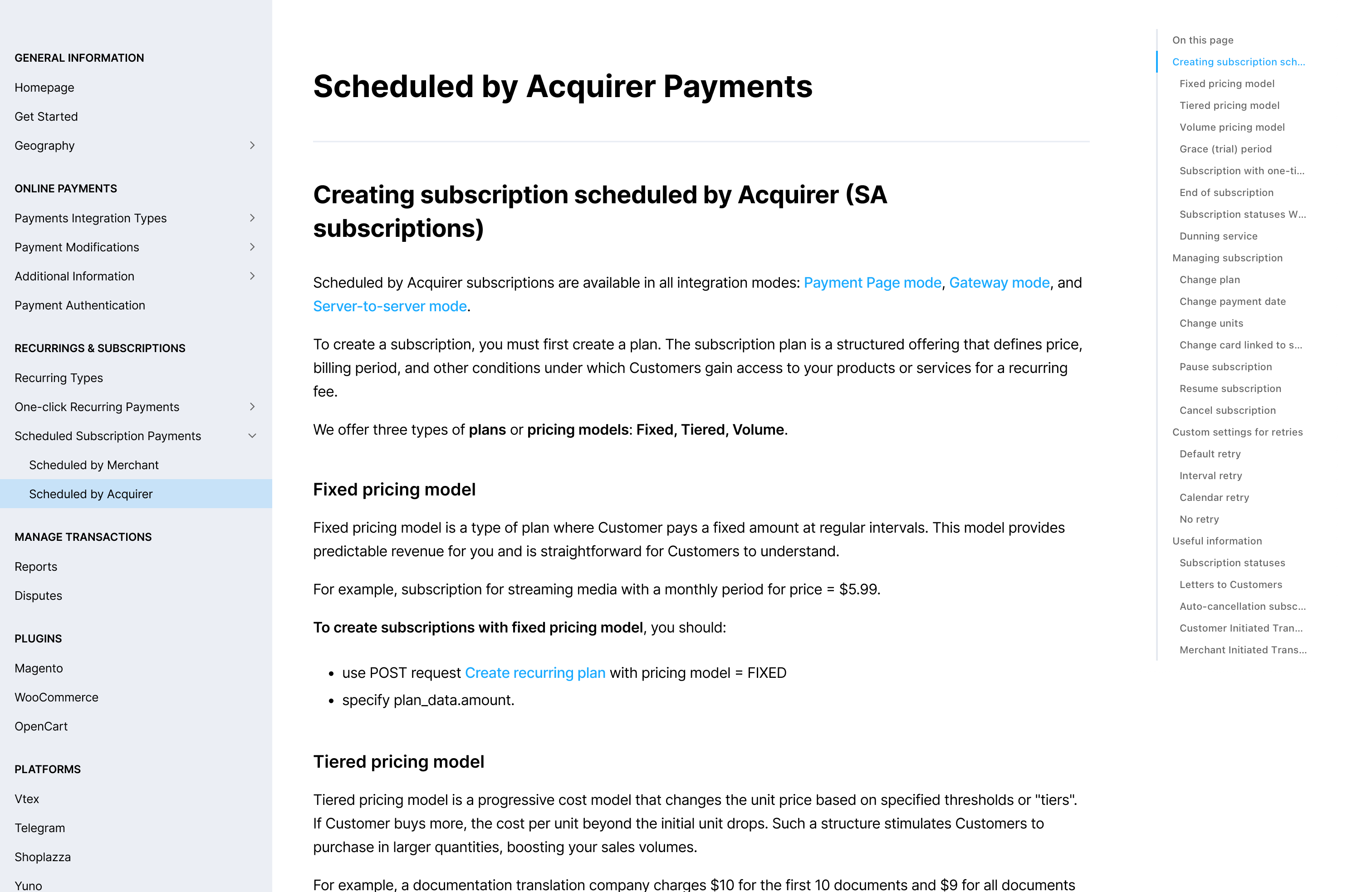
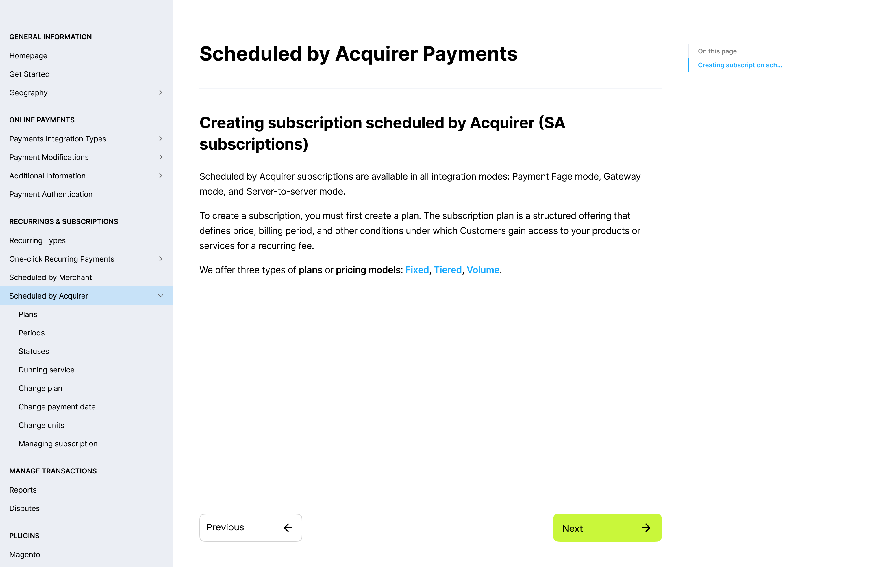
Before my work at InvestEngine, Unlimit customers complained about the complexity of the documentation’s organisation, and I was tasked with resolving this issue. I managed to eliminate one level of nesting entirely. This required reworking several sections of the documentation, but I set out clear, simple rules, so there were no problems. Nowadays, in the age of AI, this sort of refactoring can be done quickly and cheaply.