Research at Open Investments
To optimise the interface, simplify development and support accessibility, I asked the analytics team to collect statistics on the screen resolutions, devices, operating systems and font scaling used by our visitors. The data below covers the account-opening flow of an online brokerage over 3 months of 2021 – around 151,600 visits. Each table shows the ten most common values.
Operating systems
| Operating system | Visits | Visitors |
|---|---|---|
| Android 10 | 36,530 | 25.62 % |
| Windows 10 | 27,284 | 16.58 % |
| iOS 14 | 24,552 | 15.58 % |
| Android 9 Pie | 16,104 | 11.60 % |
| Android 11 | 9,048 | 5.81 % |
| Windows 7 or 2008 | 9,042 | 5.44 % |
| Android 8.1 Oreo | 5,802 | 4.13 % |
| Android 8.0 Oreo | 3,709 | 2.65 % |
| Android 7.0 Nougat | 3,049 | 2.17 % |
| Android 7.1 Nougat | 2,324 | 1.68 % |
Based on these findings, I initiated the company-funded purchase of Android phones for the two designers working on the project, so that they could understand and feel the specifics of the system, and test prototypes on real devices.
Screen resolution
| Logical width | Logical height | Visits | Visitors |
|---|---|---|---|
| 1920 | 1080 | 14,158 | 8.50 % |
| 360 | 780 | 10,116 | 7.06 % |
| 360 | 640 | 9,707 | 6.98 % |
| 393 | 851 | 9,092 | 6.42 % |
| 414 | 896 | 8,672 | 5.46 % |
| 375 | 667 | 7,729 | 5.02 % |
| 360 | 720 | 6,784 | 4.87 % |
| 1366 | 768 | 7,904 | 4.85 % |
| 360 | 760 | 5,649 | 4.03 % |
| 375 | 812 | 6,037 | 3.70 % |
Following this research, we settled on two canvas sizes for our mockups: 1366×768 for desktop and 360×640 for mobile. Every layout has been prepared in these formats since then. On desktop the real height of the visible area is smaller, since the browser chrome takes its share, so I made this template.
Devices
| Vendor and model | Visits | Visitors |
|---|---|---|
| Desktop computer | 42,605 | 25.88 % |
| Apple iPhone | 27,991 | 17.74 % |
| Xiaomi S-TELL M200 | 3,399 | 2.41 % |
| Xiaomi Redmi Note 8 Pro | 2,203 | 1.54 % |
| Xiaomi Redmi Note 7 | 1,733 | 1.24 % |
| Samsung SM-A515F | 1,663 | 1.09 % |
| Huawei JAT-LX1 | 1,371 | 0.99 % |
| Samsung SM-A505FN | 1,329 | 0.92 % |
| Huawei HRY-LX1 | 1,224 | 0.87 % |
| Huawei STK-LX1 | 1,113 | 0.79 % |
More than a quarter of our clients used desktop computers, so we kept paying attention to the specifics of the desktop user experience – interface elements such as drop zones, hover tooltips and the like.
Research at InvestEngine
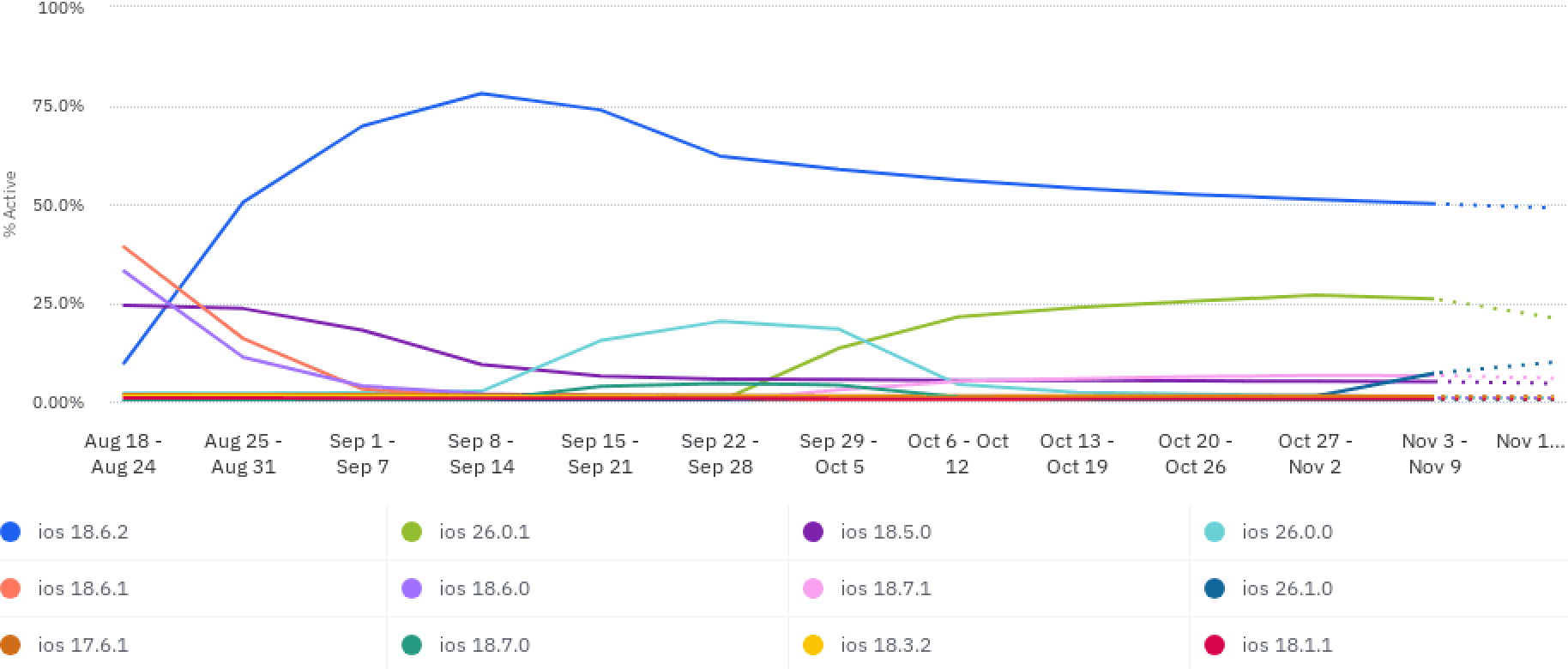
In November 2025, we discussed switching the interface to Liquid Glass (the iOS 26 visual style), and I asked for statistics on our users’ iOS versions to be compiled. It turned out that more than half of our users were still on an older version of iOS and were in no hurry to upgrade. Just over a quarter had upgraded to iOS 26. The rest were using Android. Based on this data, I decided not to include a Liquid Glass simulation in the app (as is done, for example, in Telegram), but to limit development to migrating secondary interface elements (such as drop-down menus) to system functions. Thus, the choice between the designers’ desire for visual embellishment and my concern over the numerous negative reviews of Liquid Glass was not made intuitively, but on the basis of real data about our users.
Font scales
Customer support have reported that some users are setting large font sizes on their devices, which is spoiling the interface. I have asked for statistics on font sizes to be compiled. The number 1 indicates the default system size.
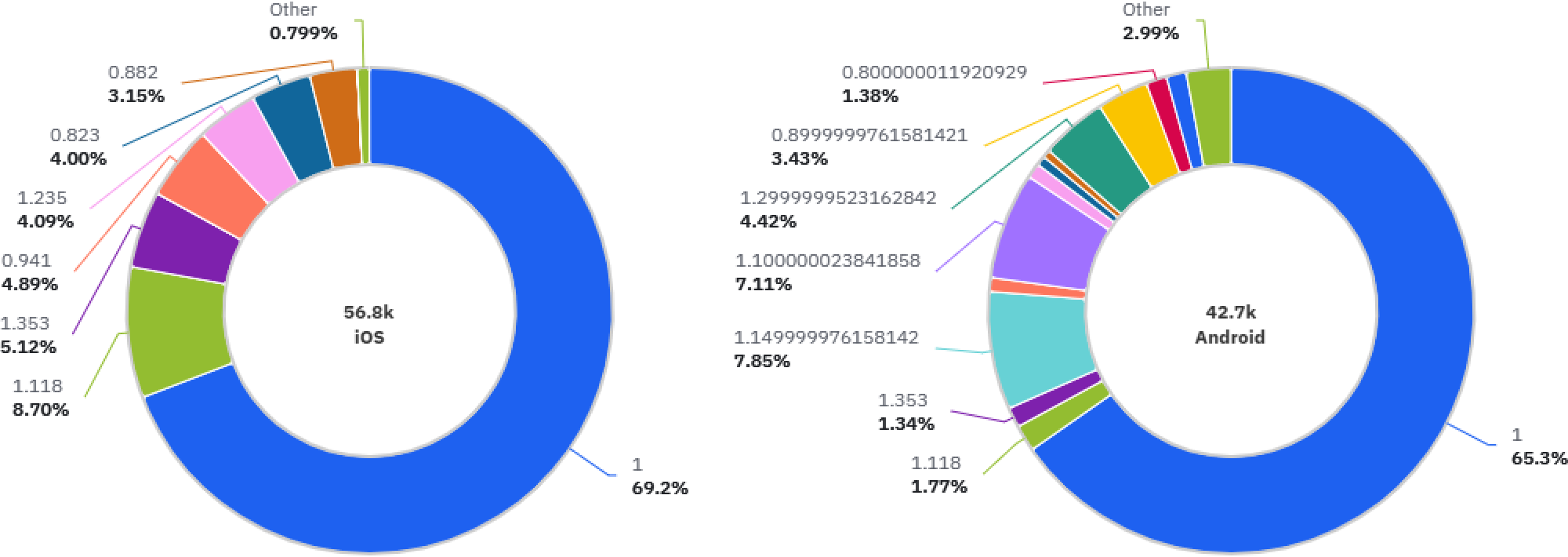
Based on the data I collected, I established a standard for checking the interface when font sizes are increased by 30%. To do this, I created an additional set of variables within the design system. This made it possible to check the layout simply by switching the appearance setting in Figma.