Situation
The vast majority of people dislike two-factor authentication. No matter how much we explain its benefits, users don’t like taking extra steps. At InvestEngine, only about 10% of users set up two-factor authentication (2FA) while it was voluntary. People believe that once they have handed their personal data to a serious company, they can stop worrying about its safety, and the company will take care of security for them.
Problem
The UK regulator, the Financial Conduct Authority (FCA), required financial companies to introduce multi-factor authentication for their users and issued recommendations on best practice. We had to make users switch to 2FA, but we wanted to do it smoothly and painlessly. Our original 2FA flow didn’t fully follow the recommended practices, didn’t cover every type of attack and had no mechanism for making users switch to 2FA.

Solution
We decided to set deadlines for switching to 2FA for both new and existing users. For existing users, the deadlines were relative rather than absolute: they depended on when we sent each user the notice about mandatory 2FA. We first rolled out the new flow to the first 1000 active users, identified the shortcomings and tested it again on the next group of a thousand. Once the best scenarios had been found and implemented, we began rolling the flow out to 10,000 users every week. This kept the load on customer support from rising sharply.
The original flow
I found many UX problems in this flow. For example, the phone number couldn’t be changed within it: the user had to abandon the flow, go to the settings, change the number there and then work out how to get back into the 2FA setup. Not to mention likely situations in which a person can’t receive text messages over the mobile network but can receive push notifications over Wi-Fi.
It therefore became clear that the 2FA flow also required reworking the settings. There were two places in the settings where the user entered a phone number: personal details and the 2FA settings. When changing the number in one place, the user had no idea whether it changed in the other, or whether the other place existed at all. That looked like a separate task, and I assigned it to another designer, but until we solved this problem, many users would have had serious difficulties setting up the 2nd factor.
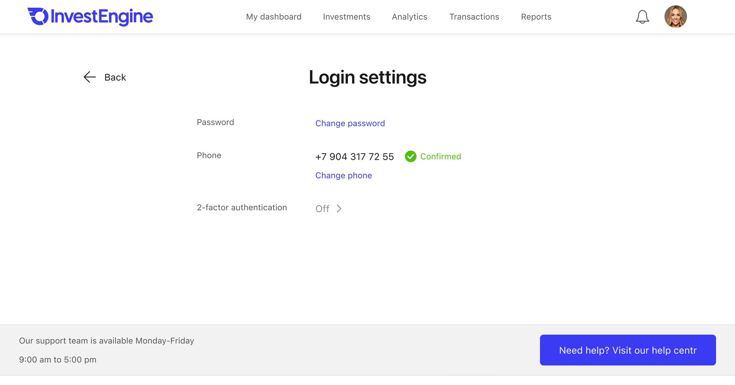
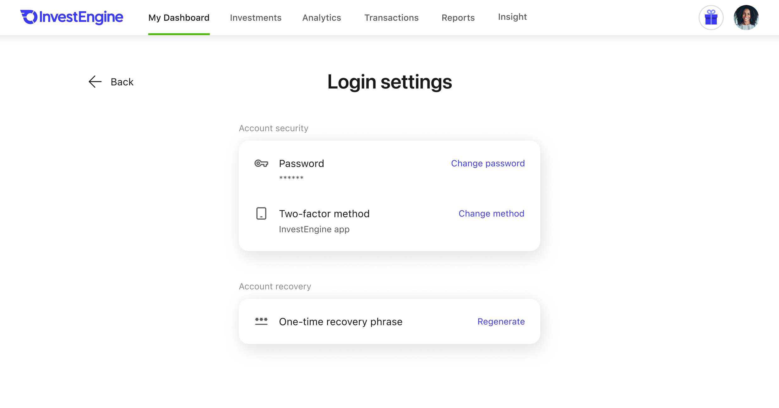
I also found a few UI problems: for instance, the instruction screen didn’t make it clear that the user first had to log in to the app. On many computers, the instructions didn’t even fit on the screen in full.
The interface copy was another big problem: too many abbreviations and technical jargon, and the same things could be called differently on different screens. I audited and edited the copy, but kept the old version as a test task for the writers I was considering when hiring a writer.
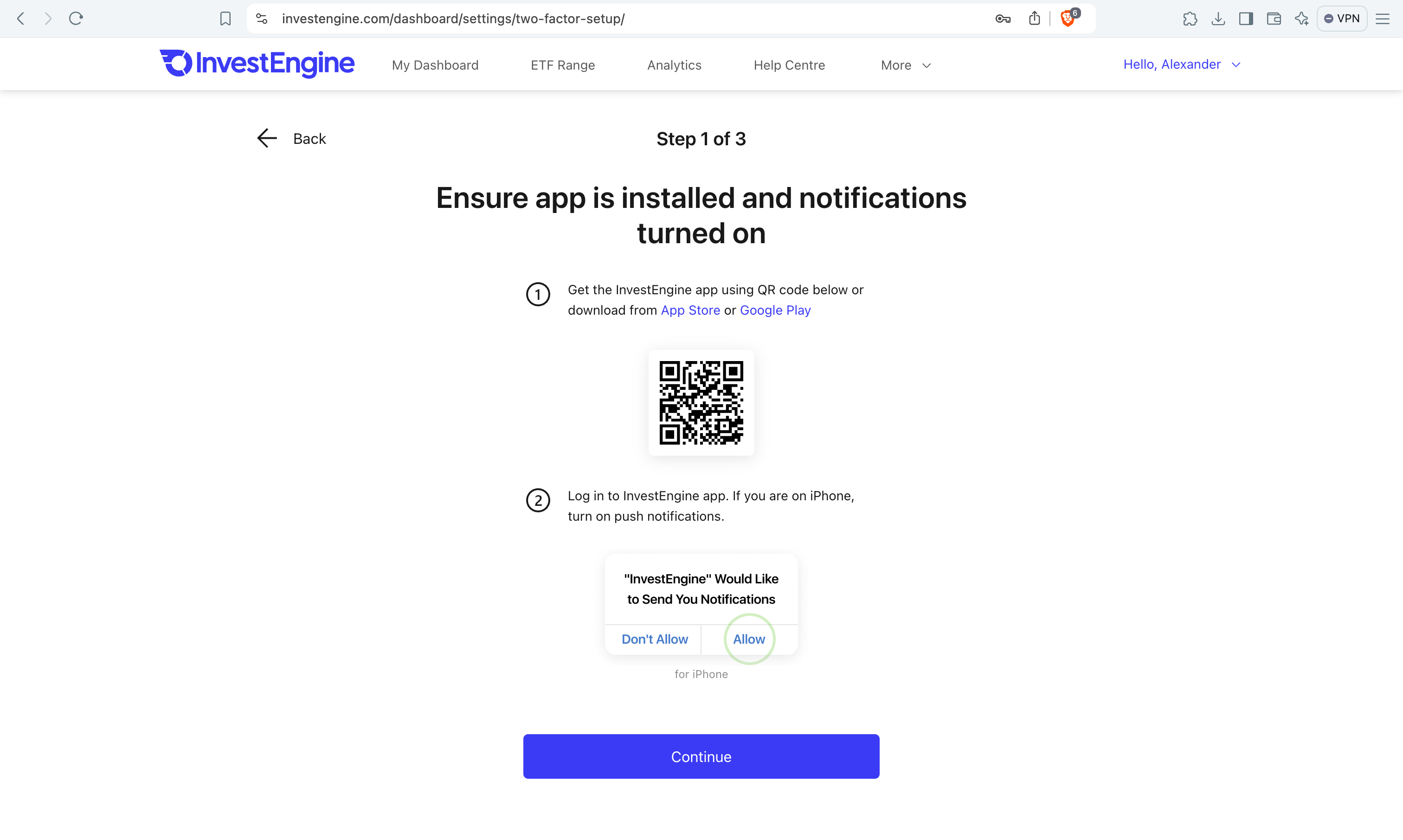
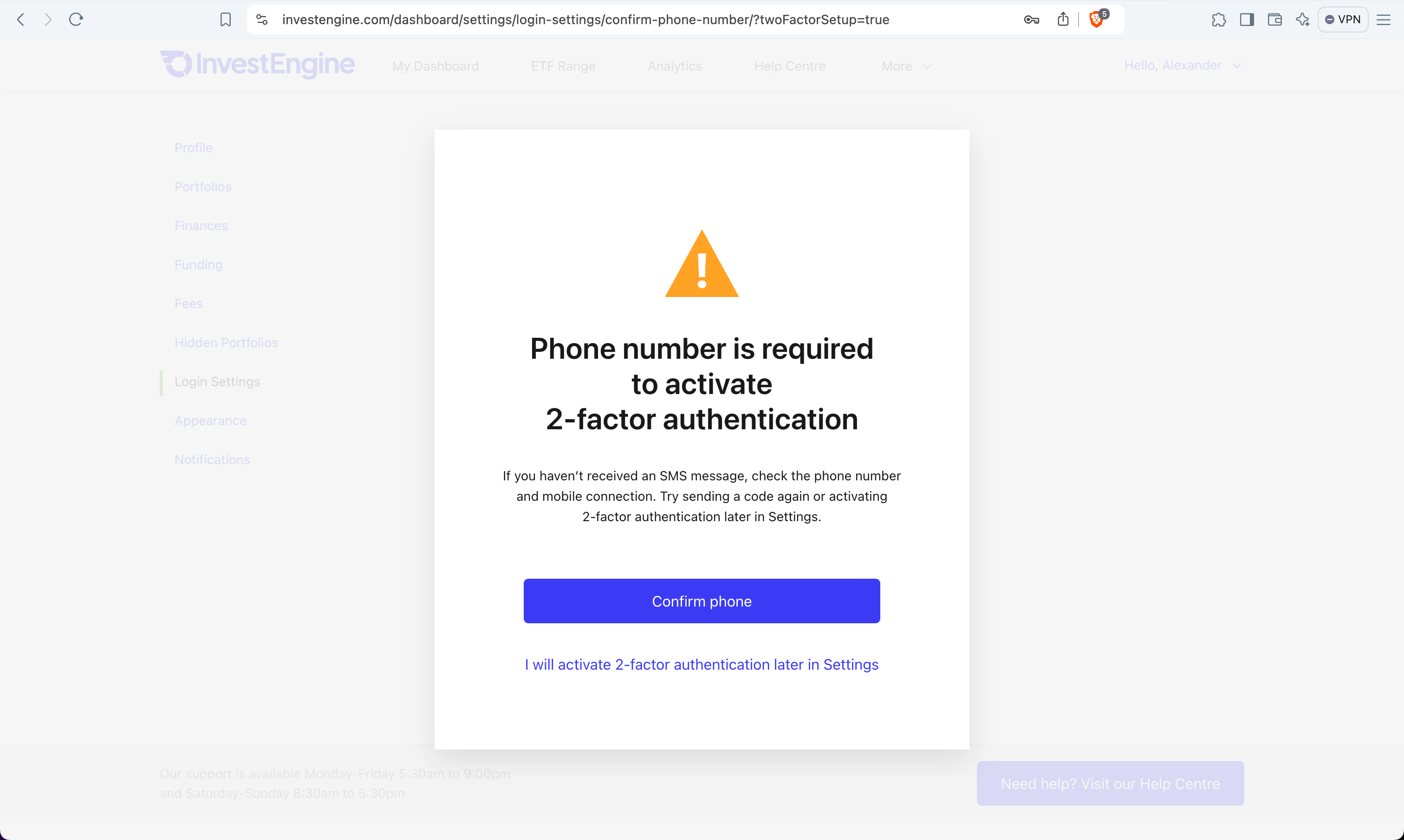
Another weak point was recovery. Both factors depended on the same phone. If it was lost, the only option on the login screen was to write to the Help Centre. And if a user logged out of the mobile app on the phone used for confirmation, they lost the ability to log in on the web.
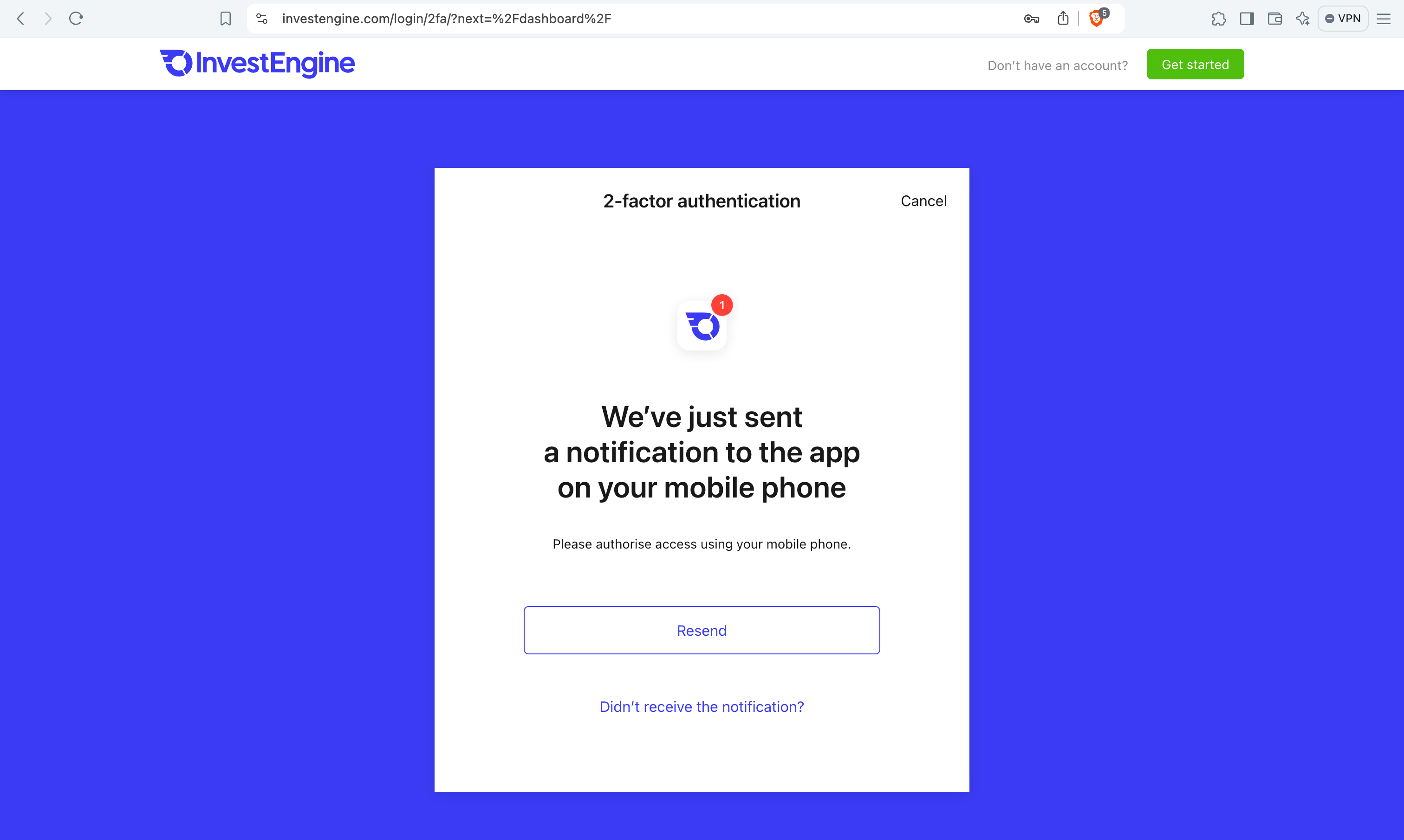
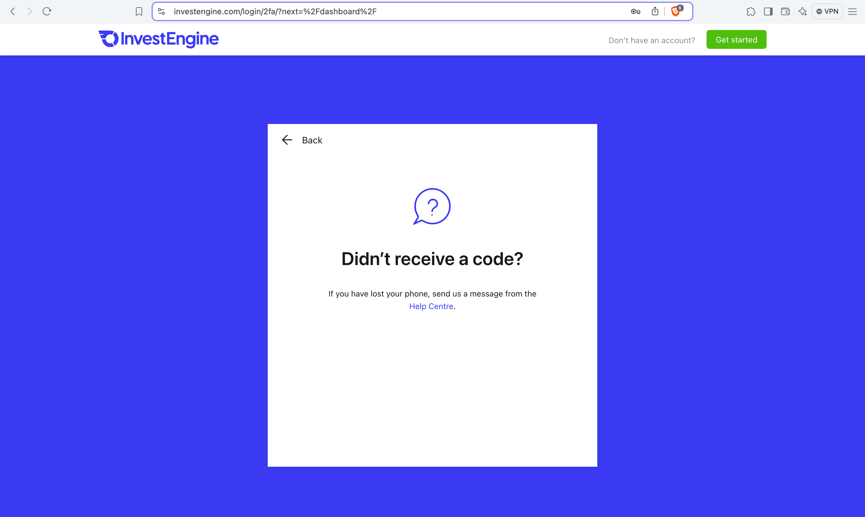
While designing the new flow, I looked for possible attacks (I’m quite familiar with cybersecurity, thanks to my experience at Acronis) and discussed them with the developers. We couldn’t get the most secure option right away, because the backend wasn’t ready to provide the necessary functions. So, we moved iteratively, gradually improving both security and the user experience.
First iteration: confirmation code
In the first redesign, the user chooses the method explicitly: in-app push notification, marked as the recommended and safest way, or SMS, marked as less secure. The phone number is no longer a mandatory step for everyone.
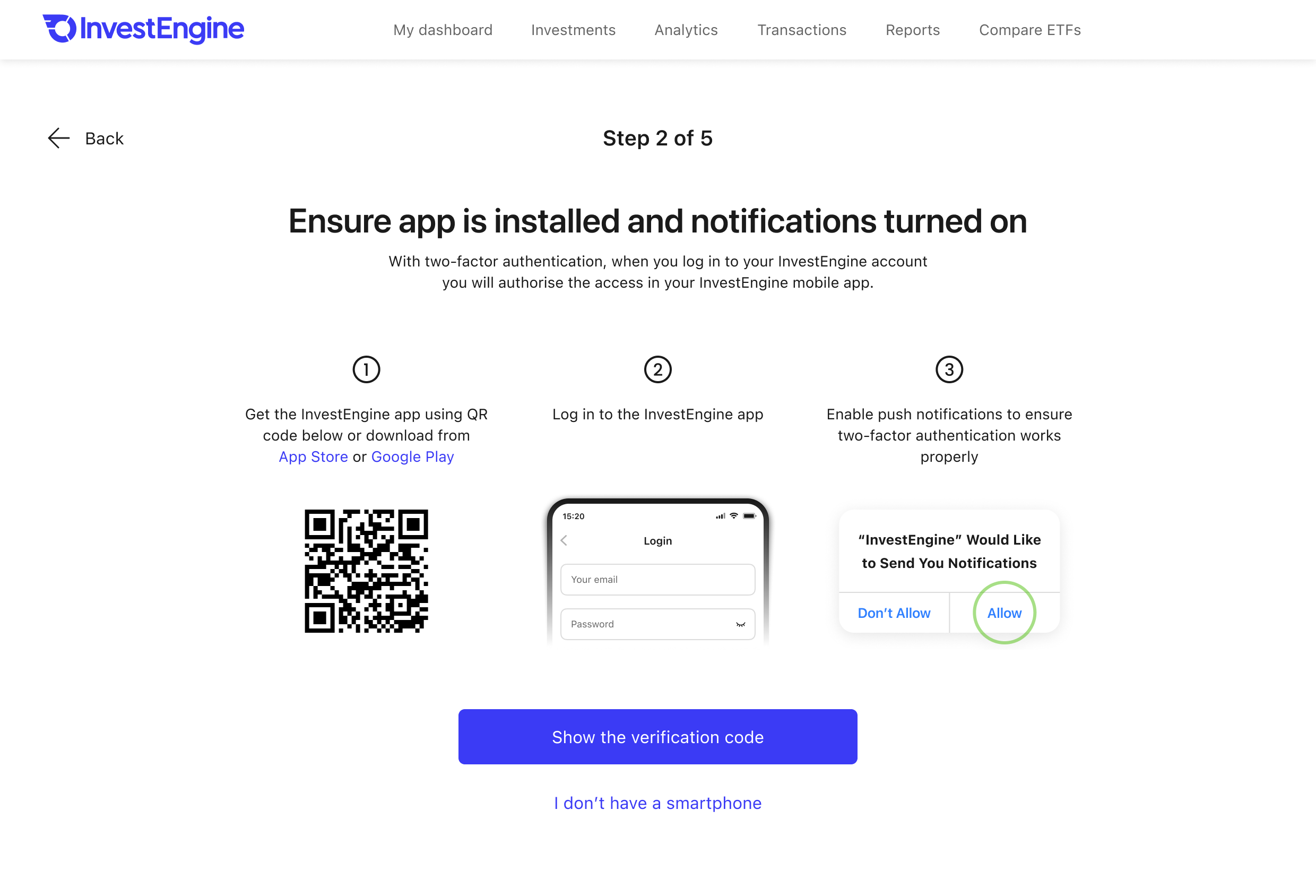
In the old flow, we sent the verification code by email. We then decided that this was not secure. In the new flow, during 2FA setup, the web browser shows the user a randomly generated 6-digit code. In the first version, the verification code appeared on the screen straight away, and at the same time an email with the code and a notification to the mobile app were sent. I wanted to save users an extra tap, but it turned out that the push notification arrived before the user had time to read about the code. This confused users. In the next version, I added a button so that the code was shown and the notification sent on a separate screen with no distractions. A notification then appears on their phone asking them to open the app and enter the verification code. In the app, the user enters the code they see in the browser, and this confirms the 2FA setup.

One of the problems we faced was that users, instead of returning to the web browser on their computer, started setting up 2FA on the phone they happened to be holding at the time. A similar problem occurred when we emailed users a link to continue the 2FA setup. We expected them to open the email on a desktop, but many opened it on their phone. As a result, two 2FA setup processes ran in parallel. I suggested storing session keys to determine how many devices were going through the same flow at once, and to abort the flow on other devices as soon as the user progressed on one of them. It turned out that the backend was almost ready for this feature, but the developers decided not to get sidetracked with the extra work and to shift the solution of the problem onto the interface.
I rewrote the copy to make them clearer, but that is usually not enough, because not all users read carefully. To strengthen the effect, I added an illustration of a laptop to the mobile app. It caught the user’s attention and made them read that they needed to continue on their computer.
Final solution: recovery phrase
It is important to distinguish between the second factor and the account recovery method. Technically, they are different things for different scenarios. SMS can serve as either, but if it is used as the second factor, it can’t also be used to recover access, as that would reduce security. For such cases, we introduced the recovery phrase.
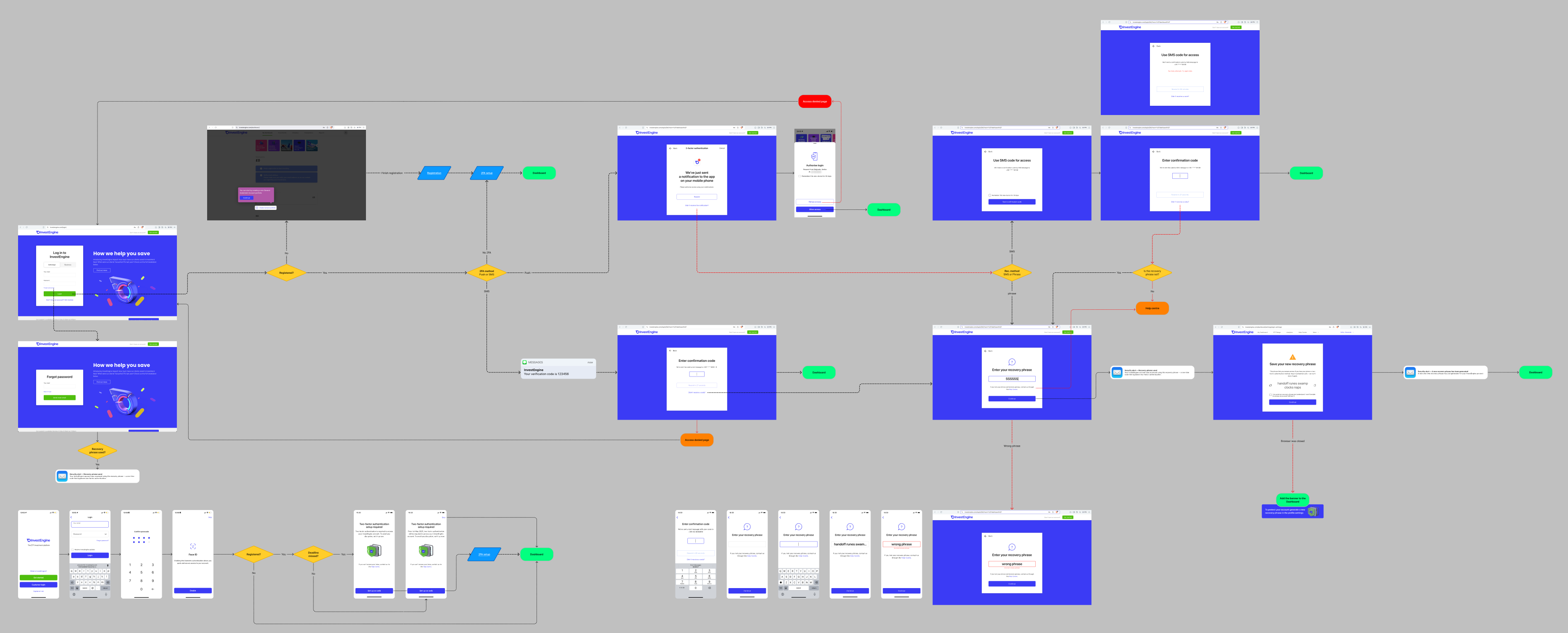
I worked out the logic of all the scenarios and drew flowcharts and screen maps. I also added many features to help the user: a new device can be remembered for 30 days, the SMS screen explains what to do after the maximum number of attempts, and the user receives a security alert by email whenever the recovery phrase is used or regenerated, or the 2FA method is changed, and banners in the app and on the website, along with emails, remind users to set up 2FA.
After the deadline, a user who logs in with a password is asked to complete the two-factor authentication setup by following a link sent by email. If the link has expired, the screen offers to send a new one. I considered and covered all the edge cases.
Further improvements
An interview conducted by the support team revealed that users log out of the mobile app because they believe it is safer. In fact, if the app installed on that phone was used as the second factor, logging out cut off access to the account on the web: the only way to log in was with the recovery phrase. And if the user hadn’t set a recovery phrase yet, they lost access to the account for good and could only restore it by calling support.
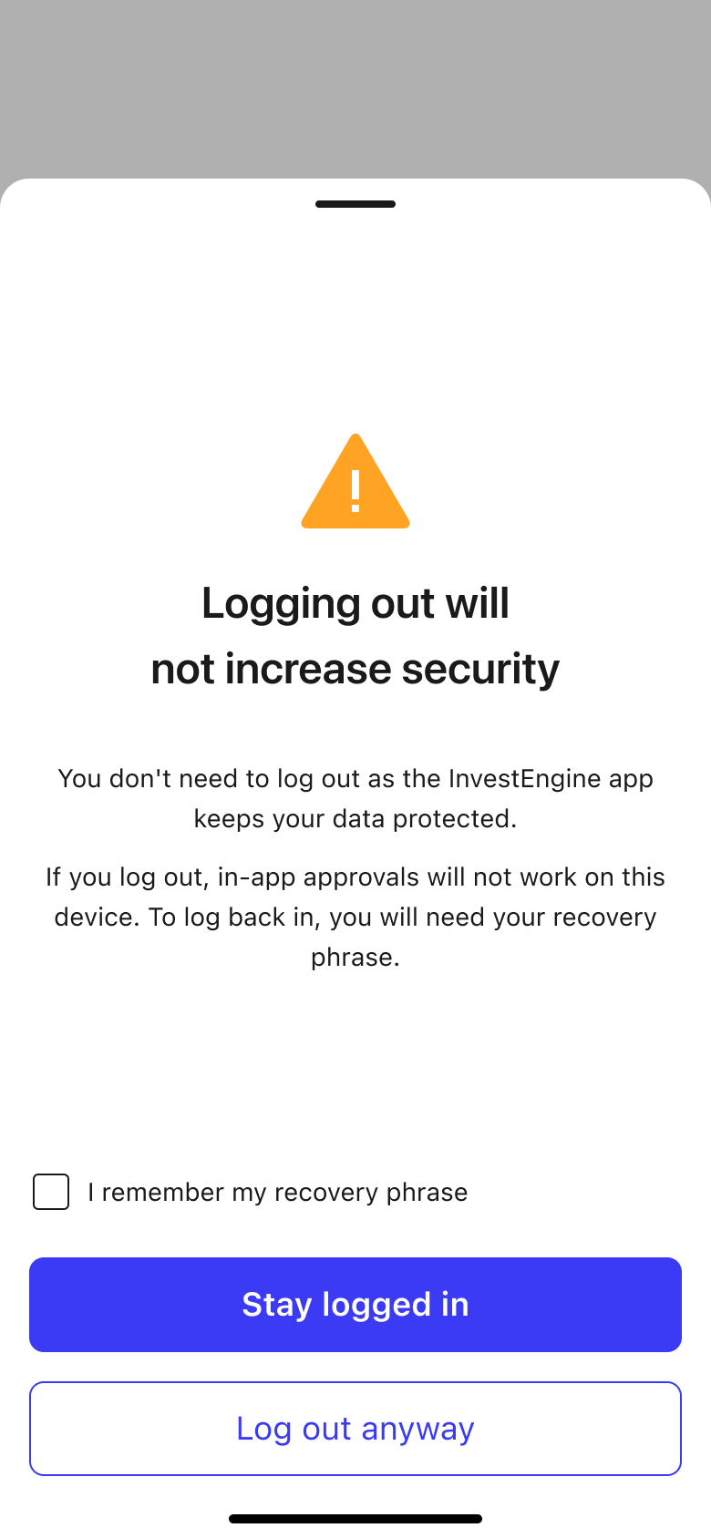
In the old flow, logging out of the app only asked whether the user was sure, with no explanation of the consequences. In the first version, I added explanatory text to the screen, but it didn’t attract much attention from users. So for the final version, I designed an additional flow. The system checks whether a recovery phrase has been set. If it hasn’t, the app doesn’t let the user log out at all, explains the problem and its consequences, and offers a choice: stay logged in or go through the scenario of creating a recovery phrase. Users who already have a recovery phrase see a different logout screen: it asks them to confirm that they remember the phrase.
Result
The company became compliant with the FCA requirements. Not all of a designer’s work is measured in KPIs, metrics and money. Sometimes it is simply a yes-or-no answer to the question: will the company continue to exist, or will it be shut down?
Conclusions
I have described only a small fraction of the problems and issues I had to deal with whilst working on this project.
Introducing changes gradually, in iterations, is good practice. It allowed us to give the feature to the first users quite early. But an overly cautious approach to change backfired: avoiding changes to the backend meant the feature had to be reworked many times, and we lost far more time on that. Besides, the FCA requirements can only be considered met once 2FA is available to all users, not just a test group. So from the very start we should have committed to the right architectural solution instead of looking for workarounds and cutting corners. On the whole, we solved the task, but it could have been done faster and better if the product designer’s advice on the project’s architecture had been listened to more closely.