Working as an art director in advertising agencies, alongside talented creative directors, has taught me to quickly come up with striking ideas and visuals that resonate with the target audience, whilst keeping the budget and business objectives in mind, and ensuring that the message is conveyed to the consumer with the utmost clarity.
I’ve come to the paradoxical conclusion that ‘a good art director has no taste’ – it sounds absurd, but there’s some truth in it: a good art director doesn’t rely on personal taste, doesn’t impose their own preferences, but adapts to the task at hand and is capable of working in a wide variety of styles. Versatility and flexibility help me to experiment with a wide range of approaches and support designers and artists working on completely different products and tasks.
Designer’s checklist
To ensure quality control and predictability at InvestEngine, I drew up a checklist which designers used not only to assess the readiness of their tasks, but also to prepare for starting work on new ones.
Beyond the digital
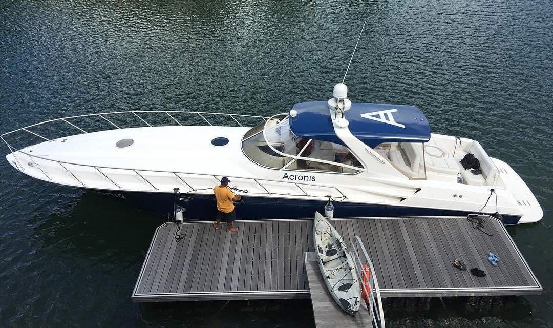
At Acronis, I was involved not only in digital product design, but also in real-world branding. Among the vehicles whose appearance I designed was even a yacht – during a business trip to Singapore, I worked not only on the yacht’s exterior but also on its interior, including selecting materials and advising on technology.

Ideation
Let’s compare 2 images (before and after). The first was generated by a designer using AI and approved by the marketing team. The second is the result of my art direction: the concept has been strengthened, and the image illustrates the message more clearly – it is now obvious that a chunk has been bitten out of the Self-Investment Personal Pension.


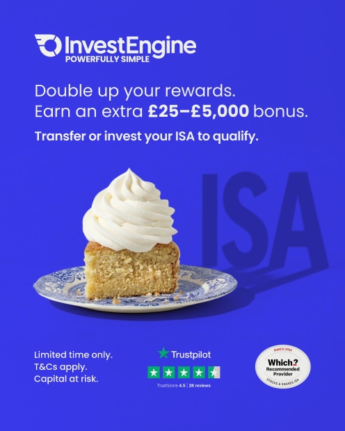
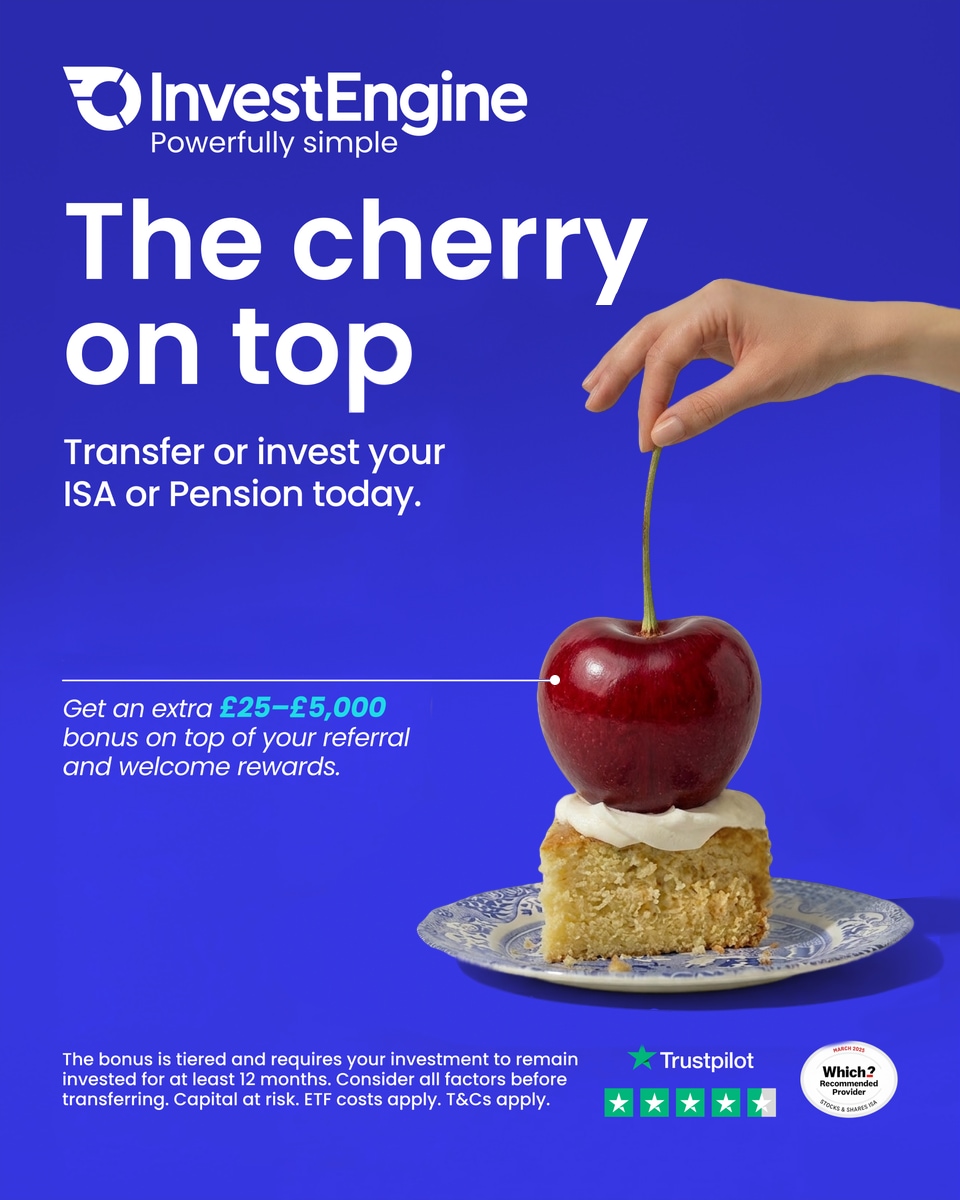
Here’s another example of how an idea was enhanced under my art direction: before and after. The designer’s original concept (first image) was good: to show that a generous amount of something extra (cream) is added to the main course (the cake). But by using the idiom ‘the cherry on top’ (second image) and exaggerating it, we showed that our offer is truly unusual and exceeds expectations. The change to the illustration also led to a change in the slogan – now both the image and the text reinforce each other.
A little touch changes everything
The state regulator refused to register the company’s logo in my country, claiming that it was too similar to Coca-Cola. A patent lawyer reached an agreement with the official that using less rounded letters would resolve the issue. I was asked to make changes that would be significant from a legal point of view, yet imperceptible to the viewer. It was no easy task, requiring a keen sense of style.
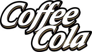
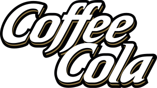
I designed most of the letters from scratch, using rectangles with rounded corners as the basis for the typeface. When you see the new logo on the street, you won’t even notice that it’s different from the old one, and you’ll recognise the brand instantly. However, when compared side-by-side, the patent office is forced to admit that the typeface is based on different principles and no longer resembles Coca-Cola. Mission accomplished!
What people are saying
Sasha leads by example – showing how to brainstorm, reason through ideas, and present solutions clearly. His curiosity, broad knowledge, and technical mindset have helped the team find thoughtful, practical solutions more than once.

Sasha is always happy to brainstorm together, suggest alternative ideas, and help find the best possible solution. He often shows how he approaches features himself and suggests ways to simplify workflows and designs, making them more usable and adaptive.